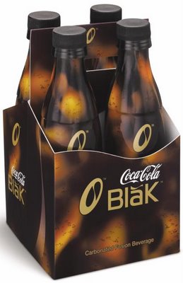
Blak to the Future

Jim said to me on Tuesday night, "Well, they have Coca-Cola Blake in Canada now." He was referring to a supermarket sighting of this product, which is called "Blak" but which has a symbol over the vowel which forces it to be pronounced long, as in "sate", rather than the expected short, as in "sat". So it may look like "Blak", and the nice folks at Coca-Cola might have expected people to pronounce it "black", which no doubt most of them do, but to look at it, it's "blake".
That's how it was in March, anyway, but it's October and times change. I was in the supermarket yesterday and saw the product in question, and the macron--that's the symbol which indicates the vowel's pronunciation--has been changed (compare the picture above to that in the March posting). Now it's a little swoosh which continues the style of the product's graphic design, but it resembles a mirror-imaged tilde, which doesn't even go over a vowel, mated with a breve (the symbol which indicates a short vowel), which at least is a step in the right direction.
Do they need a diacritical mark of any sort? Is it really necessary? We already know how to pronounce the word without any help from accent marks, real or imaginary. (At least a product such as No-Dōz honestly requires its diacritic.) Is the mark supposed to increase the coolness factor somehow, in a slightly modernized version of röck döts? Because it mostly looks kind of stupid, especially now that I note that the company's preferred spelling isn't even "Blak" but "BlaK". Also, calling your product a "carbonated fusion beverage" makes it sound as if it ought to be generating electricity.
But what the hell. I give them credit for at least getting rid of the macron, making a stab at the correct diacritic, making delicious Diet Coke, and making me think I'm going to have to try this preposterous new product (caffeine-jolted, coffee-flavoured cola!) one of these days.

0 Comments:
Post a Comment
<< Home